7주
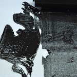
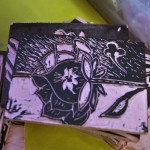
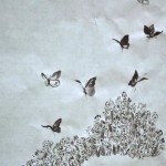
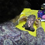
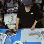
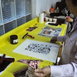
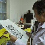
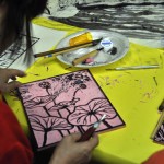
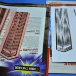
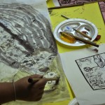
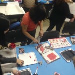
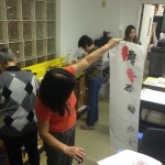
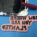
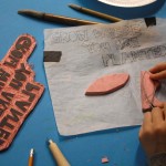
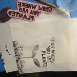
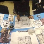
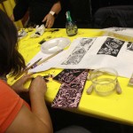
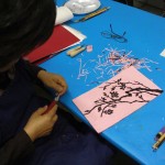
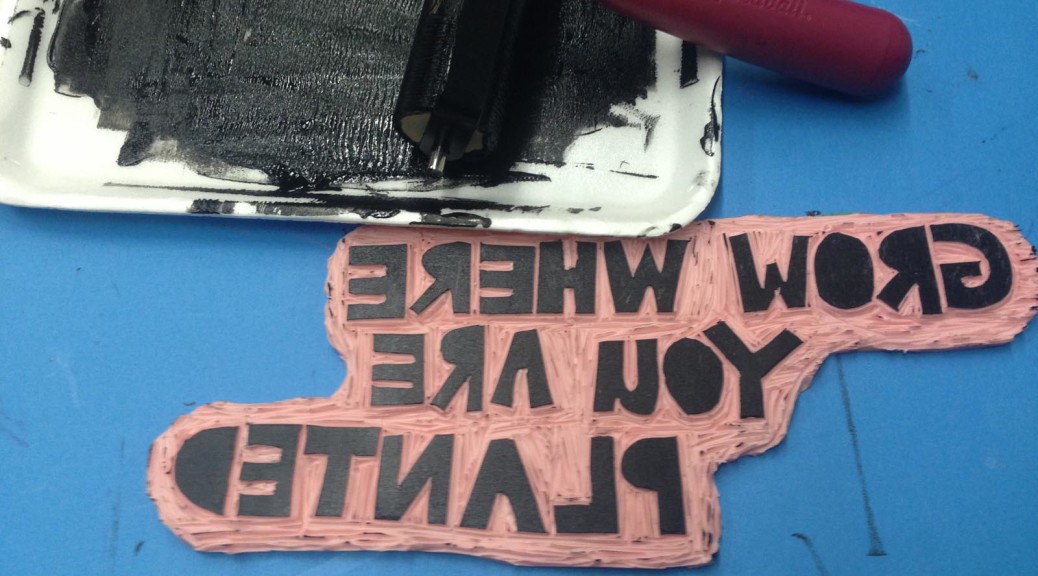
1. 이번주에는 마무리된 고무판을 화선지에 다양한 방법으로 찍어보고, 그 위에 수묵으로 그림을 그려보았습니다. 그러는 과정에서 고무판의 어떤 부분을 더 파내기도 하고 혹은 잘라내기도 하였습니다.
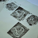
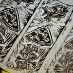
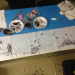
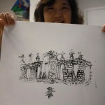
2. 진한 검정색의 판화잉크와 다소 흐리고 부드러운 톤의 먹은 쉽게 어울리지 않을수도 있습니다. 이 문제를 해결하기위해 a.진한 검정 판화 잉크와 부드러운 톤의 먹이 주는 대비감을 강조하거나 b.둘을 연결시킬 수 있는 요소를 첨가 해주어야 합니다. (첫 판화를 찍고 남은 잉크를 이용해 흐린 판화를 찍어 활용할수도 있습니다. 진하고 선명한것만이 무조건 좋은것만은 아닙니다.)
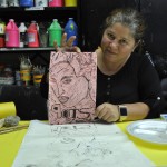
3. 작가노트를 작성하셔서 제출하셔야 합니다.
Week. 7
1. Printed on Hwasunji and added ink painting while fixing linoleum by additional carving or cutting out some part.
2. Black printmaking ink may not go well with soft tone of Korean ink. You may emphasize this contrast or add an element that connects these two different tones. Dark and clear may not necessarily the best all the time. Try to print in soft tone by adjusting printmaking ink on linoleum.
3. Write an artist statement.