Week 2
In this second week of classes, we continue to familiarize ourselves with the materials we are working with, water, watercolors, brushes, paper, and how to use them in the representation of objects.
Our first demonstration video can be seen on our Facebook page:
https://www.facebook.com/newnewyorkers/videos/649593365711222
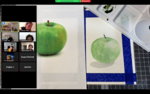
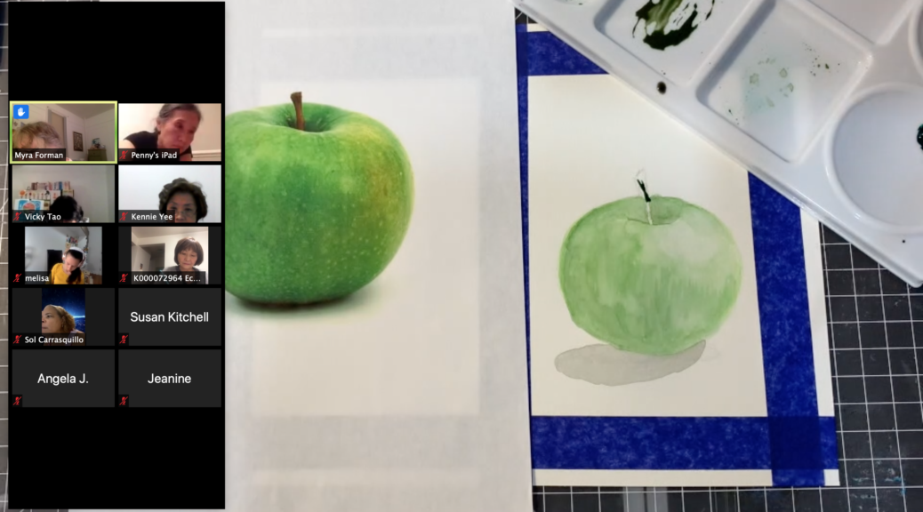
In this video, we will see how to paint, from a photograph, a green apple. The technique is very simple. We just have to be patient and begin to understand this technique that needs to wait until one color is dry before covering with a thin layer of another color the next.
Our second video:
https://www.facebook.com/newnewyorkers/videos/2706659552906489
In this video, we learned how to paint a red apple using the watercolor technique and in a very easy and entertaining way.
Question from our participants:
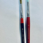
What kind of brushes do you recommend?
These are the brushes I normally use in this class:
About Light and Shadows:
We cannot speak of light and shadows without speaking of light and dark and therefore mentioning the Reinasance, Caravaggio, etc:
https://drawpaintacademy.com/chiaroscuro/
But how Can We See it?
As an artist, have you ever tried to answer this question? If not, that’s a big mistake. Everything you draw is a representation of seeing, just like the laws of physics are a representation of real processes. There’s even more to it—what we draw is not reality or an objective image of reality. It’s an image created by your brain, an interpretation of signals caught by your eyes. Therefore, the world as we see it is only an interpretation of reality, one of many—and not the truest or most perfect of them all. Only good enough for our species to survive.
Why am I talking about this in a painting tutorial? The painting itself is an art of darkening, lightening, and coloring certain parts of the paper (or screen) to create an illusion of looking at something real. In other words, an artist tries to recreate an image that could be created by our brain (it makes it easy for us since we think in patterns—we tend to look for familiar shapes in abstract pictures).
If a picture is similar to what we see in our minds, we say it’s realistic. It may be realistic despite not having any recognizable shapes or outlines—all you need are a few patches of color, light, and shadow to bring something familiar to mind.
So What Is Seeing?
Let’s go back to the fundamentals of optics. A light ray hits an object and bounces to your eye. Then the signal is processed by your brain and the image is created. That’s pretty well-known, right? But do you realize all the consequences that stem from that process?

Here comes the first, the most important rule of painting: light is the only thing we can see. It’s not an object, not a color, not a perspective, not a shape. We can see only light rays, reflected from a surface, disturbed by the properties of the surface and our eyes. The final image in our head, one frame of the never-ending video, is a set of all the rays hitting our retina at that one moment. This image can be disturbed by differences between the properties of every ray—every one of them comes from a different direction, distance, and they may have hit a lot of objects before hitting your eye last.
That’s exactly what we’re doing when painting—we imitate rays hitting different surfaces (color, consistency, gloss), the distance between them (the amount of diffuse color, contrast, edges, perspective), and most certainly we don’t draw things that don’t reflect or emit anything to our eyes. If you “add light” after the picture is almost done, you’re doing it wrong—everything on your painting is light.
Value Is the Amount of Seeing
Value is the amount of information brought with light. We’re not talking about color yet—for now, our rays can be only darker or lighter. 0% value (brightness) is no information. It doesn’t mean the object is black—we just don’t know anything about it and perceive it as black. 100% value is the maximum amount of information we can get at a time. Some objects reflect a lot of information to us and they appear bright to us, while others absorb a big part of the light hitting them and don’t reflect too much—those seem dark. And what do objects look like without light? Hint: they don’t.

This interpretation will help us understand contrast. Contrast is defined as a difference between points—the bigger the distance between them on a value scale, the stronger the contrast. All right, but where do different values come from?
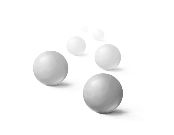
Colors of Gray: Contrast
Take a look at the illustration below. The observer gets x of information from A, and y from B. As you can see, x is much longer than y (x=3y). The bigger the distance, the bigger information loss, so in the first situation we can see B as correctly illuminated, while A is a bit duller.
The other situation is different. Here x and y look roughly the same (x=1.3y), so they’re going to bring a similar (small) amount of information.

The result from the observer’s view would look like this:

But wait, why are the closer objects dark and the distant ones light? The lighter, the more information, right? And we’ve just said the information is being lost as the distance grows.
We need to explain that loss. Why can the light from very, very distant stars come to your eyes without larger disruptions, but buildings a few miles away lose details and contrast? It’s all about atmosphere. You see a thinner layer of air when looking up than when looking ahead, and the air is full of particles. The rays traveling to your eyes at a big distance hit these particles and lose a bit of information. At the same time, these particles may reflect something else to your eyes – mainly blue of the sky. In the end, you’ll see a leftovers of the original signal mixed with impurities – it looks bright, but it brings little original information and a lot of noise.

Let’s come back to our illustration. If we draw the loss of information with gradient, it nicely shows why close objects are allowed to look dark. Also, it explains the visible value difference between close objects, and similarity of value of distant objects. Now it’s obvious why objects lose contrast with distance!

There’s even more to it. Our brain perceives depth by calculating the difference between images seen by each eye, and with distance this difference becomes less and less significant. In the end, distant objects seem flat, and close ones are more 3D.
Edges (lines) are a side effect of a proper lighting on the picture. If your painting looks flat and you need to draw outlines to bring attention to the shapes, you’re doing it wrong. Lines should appear on their own as borders between two different values, so they’re based fully on contrast.

If you use the same value for two objects, you’ll make them look merged.

The Art of Shading
After all this theoretical stuff you should have pretty good knowledge of what’s actually happening when you paint. Let’s talk about practice now.
3D Illusion
The biggest issue with shading is that it’s about creating a 3D effect on a flat sheet of paper. However, it’s no different from drawing in 3D! An artist can go pretty far avoiding this problem, focusing on a full cartoon style, but eventually, if they want to progress, they’ll need to face their arch-enemy: perspective.
What does perspective have to do with shading? More than one could think. Perspective is a tool to draw 3D objects in 2D without making them look flat. Since they’re 3D, light strikes them in various ways, creating highlights and shadows.
…more? go to: